
Customized Underlines
To apply underlines to links that are slightly different than the simple text-decoration: underline, you can switch off the underline and use some other jiggery-pokery to achieve underlining effects.
Borders
You can apply a border to the bottom of the link, which gives you control over the color of the underline (whereas text-decoration will only apply an underline in the same color as the text of the link itself) and also the pattern of the border:
a {
    text-decoration: none;
    border-bottom: 2px dotted #0c0;
}
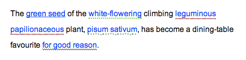
Images
Another way to apply more interesting underlines to links is to use small background images aligned to the bottom of the link that repeat horizontally:
p {
    line-height: 2;
}

a {
    text-decoration: none;
    padding-bottom: 5px;
    background: url(images/underline_greenspots.gif) bottom repeat-x;
}
If you use this approach, you’ll need to make sure that the containing block (in this case a paragraph) has the room for the underline. Usually, you’ll also need to add a little padding at the bottom of the link, so that the background image falls under the text, rather than behind it.
See a collection of examples of the methods mentioned above.
Transitions
The basic underline can be turned on and off when a cursor hovers over a link with CSS such as this:
a {
    text-decoration: none;
}

a:hover {
    text-decoration: underline;
}
Transitions give you more control over this, however, and you can maintain the underline but rather than simply showing it and hiding it, you can fade between two colors:
a {
    color: rgb(0,102,204);
    text-decoration: none;
    border-bottom: 2px solid rgba(0,102,204,.2);
    -webkit-transition: .5s;
    transition: .5s;
}

a:hover {
    border-color: rgb(0,102,204);
}
This will start off with a semi-transparent faded underline that will smoothly turn solid blue when the link is hovered over.
You can see variations on this theme in the Simple CSS Transitions example page.