CSS Backgrounds: Multiples, Size, and Origin
As well as plastering a single or tiling background image across parts of your page, you can also apply multiple backgrounds, adjust the size of background images, and define the origin of a background based on levels of the box model.
Multiple backgrounds
This is the boogie web designers have been crying out for since Bing Crosbie was topping the charts.

CSS3 allows you to apply multiple background images to a single box by simply putting image locations in a comma-separated list:
background-image: url(this.jpg), url(that.gif), url(theother.png);
More usefully, you can also define all of the other delightful background aspects. If you wanted to style a chunky button-like link with separate background, bullet, and arrow, for example, you could use something like:
background: url(bg.png), url(bullet.png) 0 50% no-repeat, url(arrow.png) right no-repeat;
Easy, right? It’s just the same as using background-image, background-position, background-repeat, background-attachment, and background, except you can specify more than one background with the aid of that helpful little comma.
Background size
The background-size property allows you to stretch or compress a background image.

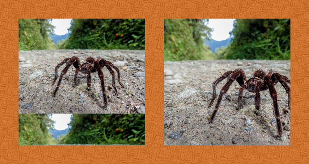
background-size: contain and background-size: coverThe values can be:
auto, which maintains the background image’s original size and width/height ratio.- lengths, a width and a height, such as
100px 50px(100px wide, 50px high). Specifying a single length, such as100pxwill result the equivalent of100px auto. - percentages, a width and a height, such as
50% 25%(50% of the width of the background area, 25% of the height of the background area). Specifying a single percentage, such as50%will result the equivalent of50% auto. - A combination of lengths, percentages, and
auto, such as80px auto(80px wide, automatic height to maintain the image’s original ratio) contain, which maintains the background image’s original ratio and makes it as large as possible whilst fitting entirely within the box’s background area.cover, which maintains the background image’s original ratio and makes it large enough to fill the entire background area, which may result in cropping of either the height or width.
Background origin
background-origin is the remarkably dull kid of the bunch. Not unintelligent, just dull. The kid that the other kids point and laugh at. The property defines where the background area of a box actually starts. If you think of the box model, when you set a background it should, by default, start from the upper-left corner of the padding box. So if you had…
#burrito {
    width: 400px;
    height: 200px;
    border: 10px solid rgba(0,255,0,.5);
    padding: 20px;
    background: url(chilli.png) 0 0 no-repeat;
}
…the background image should appear in the top left corner, in the padding box, immediately after the inner edges of a green border. You can change this behavior, however, with background-origin. Its self-descriptive values can be padding-box (default, as described above), border-box, and content-box.
So adding background-origin: border-box to the previous example will cause the origin of the background image to be tucked up inside the border.
